Directives
Marpit Markdown uses extended syntax called “Directives” to support writing awesome slides. It can control your slide-deck theme, page number, header, footer, style, and so on.
Usage
The written directives would parse as YAML.
When the value includes YAML special chars, you should wrap with quotes to be recognized correctly. You may enable a loose parsing by looseYAML Marpit constructor option if you want.
HTML comment
<!--
theme: default
paginate: true
-->
?> The HTML comment is also used for presenter notes. When it is parsed as a directive, it would not be collected in the comments result of Marpit.render().
Front-matter
Marpit also supports YAML front-matter, that is a syntax often used for keeping metadata of Markdown. It must be the first thing of Markdown, and between the dash rulers.
---
theme: default
paginate: true
---
Please not confuse to the ruler for paging slides. The actual slide contents would start after the ending ruler of front-matter.
Type of directives
Global directives {docsify-ignore}
Global directives are the setting value of the whole slide deck such as theme. Marpit recognizes only the last value if you wrote a same global directives many times.
!> $ prefix for global directives has removed in v1.4.0. Developer may re-define dollar-prefixed custom directives as an alias to built-in directive if necessary.
Local directives {docsify-ignore}
Local directives are the setting value per slide pages. These would apply to defined page and following pages.
<!-- backgroundColor: aqua -->

This page has aqua background.

---

The second page also has same color.
Apply to a single page (Spot directives)
If you want to apply local directives only to the current page, you have to add the prefix _ to the name of directives.
<!-- _backgroundColor: aqua -->

Add underscore prefix `_` to the name of local directives.

---

The second page would not apply setting of directives.
Diagram
Global directives
| Name | Description |
|---|---|
headingDivider | Specify heading divider option. |
lang | Set the value of lang attribute for each slide |
style | Specify CSS for tweaking theme. |
theme | Specify theme of the slide deck. |
Theme
Choose a theme with theme global directive.
<!-- theme: registered-theme-name -->
It recognizes the name of theme added to themeSet of Marpit instance.
Tweak theme style
Normally you may tweak theme by <style> element, but it might break a style for documentation when opening in another Markdown editor. Thus you can use style global directive instead of <style>.
---
theme: base-theme
style: |
  section {
    background-color: #ccc;
  }
---
Heading divider
You may instruct to divide slide pages automatically at before of headings by using headingDivider global directive. This feature is similar to Pandoc’s --slide-level option and Deckset 2’s “Slide Dividers” option.
It have to specify heading level from 1 to 6, or array of them. This feature is enabled at headings whose the level larger than or equal to the specified value if in a number, and it is enabled at only specified levels if in array.
For example, the below two Markdowns have the same output.
Regular syntax
# 1st page

The content of 1st page

---

## 2nd page

### The content of 2nd page

Hello, world!

---

# 3rd page

😃
Heading divider
<!-- headingDivider: 2 -->

# 1st page

The content of 1st page

## 2nd page

### The content of 2nd page

Hello, world!

# 3rd page

😃
It is useful when you want to create a slide deck from a plain Markdown. Even if you opened Markdown that is using headingDivider in general editor, it keeps a beautiful rendering with no unsightly rulers.
?> Marpit constructor can set a default level of heading divider.
Local directives
| Name | Description |
|---|---|
paginate | Show page number on the slide if you set true. |
header | Specify the content of slide header. |
footer | Specify the content of slide footer. |
class | Specify HTML class of slide’s <section> element. |
backgroundColor | Setting background-color style of slide. |
backgroundImage | Setting background-image style of slide. |
backgroundPosition | Setting background-position style of slide. |
backgroundRepeat | Setting background-repeat style of slide. |
backgroundSize | Setting background-size style of slide. |
color | Setting color style of slide. |
Pagination
We support pagination by the paginate local directive.
<!-- paginate: true -->

You would be able to see a page number of slide in the lower right.
Configuring pagination
There are 2 things happening on each slide:
- the page number is rendered and
- the page number is being incremented.
You can control both of these with the paginate directive:
paginate | Page number | Increment |
|---|---|---|
true | Show | Yes |
false | Hide | Yes |
hold | Show | No |
skip | Hide | No |
Skip pagination on title slide
A common use case is excluding the title slide from pagination.
For this you simply have to define the paginate directive on the second page instead of the first.
# Title slide

This page will not have pagination by lack of the `paginate` directive.

---

<!-- paginate: true -->

Pagination will render from this slide onwards (starting at 2).
Or you can use the spot directive.
---
paginate: true
_paginate: false # or use `_paginate: skip`
---
paginate: skip and paginate: hold
To both exclude a page from pagination and hide the pagination at the same time use skip:
<!-- _paginate: skip -->

# Slide to exclude

This page will not update the page number and also not show the pagination
You can exclude a page from pagination but keep the pagination visible using hold:
---
paginate: true
---

# Slide 1

[](./assets/image_01.png)

> Page 1 of 1

---

<!-- _paginate: hold -->

# Slide 2

[](./assets/image_02.png)

> Page 1 of 1
Header and footer
When you have to be shown the same content across multiple slides like a title of the slide deck, you may use header or footer local directives.
---
header: 'Header content'
footer: 'Footer content'
---

# Page 1

---

## Page 2
It will render to HTML like this:
<section>
  <header>Header content</header>
  <h1>Page 1</h1>
  <footer>Footer content</footer>
</section>
<section>
  <header>Header content</header>
  <h2>Page 2</h2>
  <footer>Footer content</footer>
</section>
The content will be wrapped by a corresponding element, and insert to a right place of each slide. These could see as the part of slide contents.
If you want to place these contents to the marginal of the slide as like as PowerPoint, you have to use supported theme.
Formatting
In addition, you can format the content of header/footer through markdown syntax and insert inline images.
---
header: '**bold** _italic_'
footer: ''
---
NOTE: Wrap by (double-)quotes to avoid parsed as invalid YAML.
?> You cannot use ![bg]() syntax in header and footer directives due to the parsing order of Markdown.
Styling slide
Class
At the some page, you might think want to change the layout, theme color, and so on. class local directive can change a class attribute of <section> element of slide page.
Let’s say you’re using a theme includes a rule like this:
section.lead h1 {
  text-align: center;
}
You could use the centered leading header by setting class spot directive to lead.
<!-- _class: lead -->

# THE LEADING HEADER
Backgrounds
If you want to use any color or the gradient as background, you can set style through backgroundColor or backgroundImage local directives.
<!-- backgroundImage: "linear-gradient(to bottom, #67b8e3, #0288d1)" -->

Gradient background

---

<!--
_backgroundColor: black
_color: white
-->

Black background + White text
In addition, we have supported customize for these declarations:
backgroundColorbackgroundImagebackgroundPosition(centerby default)backgroundRepeat(no-repeatby default)backgroundSize(coverby default)color
?> It also can use extended image syntax if you want to set image or color as background to single page.
Advanced
Custom directives
Developer can extend recognizable directives. For example, Marp Core has extended size global directive to change slide size in Markdown. Marp CLI will add directives for setting meta properties of converted HTML.
Marpit instance has customDirectives.global and customDirectives.local object to allow adding directives as you like.
Custom global directive
The following example is defining dollar-prefixed alias of built-in theme global directive.
marpit.customDirectives.global.$theme = (value, marpit) => {
  return { theme: value }
}
Please define a function to handle passed value from Markdown. The first argument is the passed value(s), and the second is the current Marpit instance. It should return an object includes pairs of key-value for passing to same kind directives.
Custom local directive
Custom directives also can provide a way of assigning multiple same kind directives at once. Let’s define colorPreset local directive for assigning preset of slide colors.
marpit.customDirectives.local.colorPreset = (value, marpit) => {
  switch (value) {
    case 'sunset':
      return { backgroundColor: '#e62e00', color: '#fffff2' }
    case 'dark':
      return { backgroundColor: '#303033', color: '#f8f8ff' }
    default:
      // Return an empty object if not have to assign new values
      return {}
  }
}
Now you can use the defined colorPreset local directive with same way of built-in local directives. The underscore prefix (_colorPreset) for applying preset to single slide also works well.
<!-- colorPreset: sunset -->

# Sunset color preset

---

<!-- _colorPreset: dark -->

# Dark color preset

---

# Sunset color preset
?> The returned key-value will assign to marpitDirectives property in meta object of predetermined markdown-it token(s) by the kind of directive. It would be useful for using assigned value in markdown-it plugin.
Image syntax
Marpit has extended Markdown image syntax  to be helpful creating beautiful slides.
| Features | Inline image | Slide BG | Advanced BG |
|---|---|---|---|
| Resizing by keywords | auto only | ✔️ | ✔️ |
| Resizing by percentage | ❌ | ✔️ | ✔️ |
| Resizing by length | ✔️ | ✔️ | ✔️ |
| Image filters | ✔️ | ❌ | ✔️ |
| Multiple backgrounds | - | ❌ | ✔️ |
| Split backgrounds | - | ❌ | ✔️ |
Basically the extended features can turn enable by including corresponded keywords to the image’s alternative text.
Resizing image
You can resize image by using width and height keyword options.
 <!-- Setting width to 200px -->
 <!-- Setting height to 300px -->
 <!-- Setting both lengths -->
We also support the shorthand options w and h. Normally it’s useful to use these.
 <!-- Setting size to 32x32 px -->
Inline images only allow auto keyword and the length units defined in CSS.
!> Several units related to the size of the viewport (e.g. vw, vh, vmin, vmax) cannot use to ensure immutable render result.
Image filters
You can apply CSS filters to image through markdown image syntax. Include <filter-name>(:<param>(,<param>...)) to the alternate text of image.
Filters can use in the inline image and the advanced backgrounds.
| Markdown | w/ arguments |
|---|---|
![blur]() | ![blur:10px]() |
![brightness]() | ![brightness:1.5]() |
![contrast]() | ![contrast:200%]() |
![drop-shadow]() | ![drop-shadow:0,5px,10px,rgba(0,0,0,.4)]() |
![grayscale]() | ![grayscale:1]() |
![hue-rotate]() | ![hue-rotate:180deg]() |
![invert]() | ![invert:100%]() |
![opacity]() | ![opacity:.5]() |
![saturate]() | ![saturate:2.0]() |
![sepia]() | ![sepia:1.0]() |
Marpit will use the default arguments shown in above when you omit arguments.
Naturally multiple filters can apply to a image.

Slide backgrounds
We provide a background image syntax to specify slide’s background through Markdown. It only have to include bg keyword to the alternate text.

When you defined two or more background images in a slide, Marpit will show the last defined image only. If you want to show multiple images, try the advanced backgrounds by enabling inline SVG slide.
Background size
You can resize the background image by keywords. The keyword value basically follows background-size style.

| Keyword | Description | Example |
|---|---|---|
cover | Scale image to fill the slide. (Default) |  |
contain | Scale image to fit the slide. |  |
fit | Alias to contain, compatible with Deckset. |  |
auto | Not scale image, and use the original size. |  |
x% | Specify the scaling factor by percentage value. |  |
You also can continue to use width (w) and height (h) option keywords to specify size by length.
Advanced backgrounds
!> 📐 It will work only in experimental inline SVG slide.
The advanced backgrounds support multiple backgrounds, split backgrounds, and image filters for background.
Multiple backgrounds


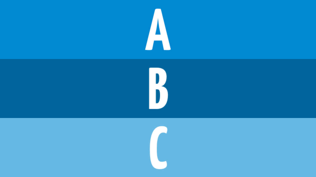
These images will arrange in a horizontal row.
Direction keyword
You may change alignment direction from horizontal to vertical, by using vertical direction keyword.


Split backgrounds
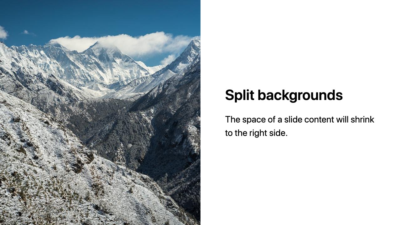
The left or right keyword with bg keyword make a space for the background to the specified side. It has a half of slide size, and the space of a slide content will shrink too.

# Split backgrounds
The space of a slide content will shrink to the right side.
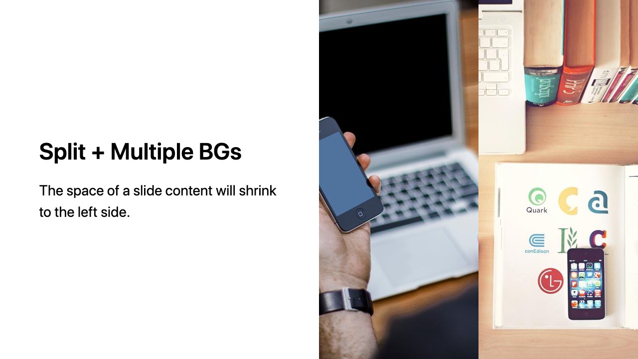
Multiple backgrounds will work well in the specified background side.


# Split + Multiple BGs
The space of a slide content will shrink to the left side.
This feature is similar to Deckset’s Split Slides.
?> Marpit uses a last defined keyword in a slide when left and right keyword is mixed in the same slide by using multiple backgrounds.
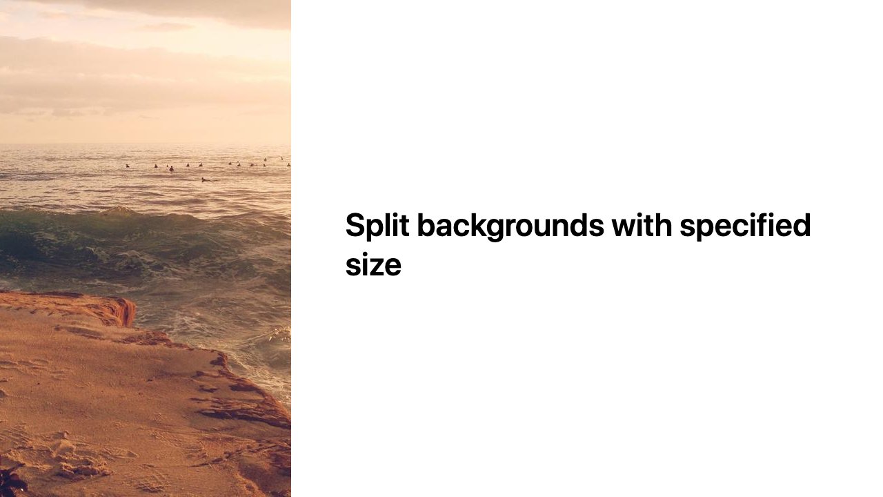
Split size
Marpit can specify split size for background by percentage like left:33%.

